

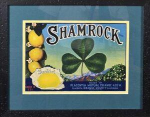
Shamrock Sunkist Lemons Fruit Label, Circa 1930s
The Shamrock Sunkist Lemons Fruit Label is a classic example of early 20th-century citrus crate labeling from Southern California’s booming agricultural industry. Produced during the 1930s, it served as a marketing tool for premium lemons shipped in wooden crates, blending whimsical symbolism with regional pride to promote the Sunkist brand’s high-quality fruit. While primarily associated with lemons, variants of the Shamrock design appeared on other citrus like oranges and grapefruit, reflecting the era’s versatile branding strategies.
History and Production
The label emerged amid California’s citrus “gold rush,” where commercial shipments began in the 1880s via rail to Eastern markets, transforming arid regions into orchard powerhouses through irrigation and cooperative marketing. By the 1930s, the industry had exploded: California’s citrus acreage grew from 3,000 in 1880 to over 40,000 by 1893, with lemons gaining prominence after Sunkist’s 1915 campaigns countered Italian imports, capturing 90% of the U.S. market by 1924. The Shamrock label was lithographically printed—using vibrant, multi-color processes affordable by the interwar period—for wooden crates sized approximately 12 3/8″ x 8 3/8″, pasted onto boxes for protection during rail transport via lines like the Northern Pacific. Production focused on seasonal peaks (winter-spring harvests), with labels denoting grades: premium (vibrant colors) for top-tier fruit, mid-grade for standard, and simpler designs for lower-quality. Minor variations existed for crate sizes or fruit types, but wear from moisture in cold storage was common. The wooden crate era ended in the late 1950s with pre-printed cardboard boxes, mechanization, and post-WWII shifts.
Design
The label exemplifies 1930s commercial art, featuring a giant, stylized shamrock leaf dominating the composition—symbolizing luck and freshness—set against an idyllic citrus grove with rolling hills, distant mountains, and a small Sunkist lemon in the corner for branding. Bold, ornate typography proclaims “Shamrock Sunkist Lemons” in multi-color lithography (greens, yellows, reds), framed by subtle geometric borders echoing Art Deco influences. This “advertising phase” design (post-1922) centered the fruit prominently to entice consumers, evoking California’s sunny allure while ensuring visibility on stacked rail cars. Printed regionally (e.g., in Los Angeles), it balanced functionality with aesthetic appeal, using catchy motifs to differentiate identical lemons in a competitive market.
Company Behind It
The label was produced by the Placentia Mutual Orange Association, a grower-owned cooperative in Placentia, Orange County, California, formalized around 1910–1920 as part of the broader Sunkist network. Affiliated with Sunkist Growers, Inc. (originally the California Fruit Growers Exchange, est. 1893; renamed 1952), which represented over 5,000 members by 1905 and controlled 45% of California’s citrus by then. Sunkist handled marketing, logistics, and supplies (via its 1907 Fruit Growers Supply Company), shipping lemons nationwide and abroad while standardizing grades through branded labels. Placentia Mutual focused on local harvesting, packing, and crating of lemons, oranges, and grapefruit from family-run groves (often 40 acres or less), emphasizing “sun-ripened” quality. No single key figure is tied to the Shamrock line, but operations mirrored Sunkist’s cooperative model, boosting returns amid economic peaks like the Roaring Twenties and challenges like the Great Depression.
Cultural Significance
The Shamrock label captures the romance of California’s citrus boom, selling not just lemons but an idealized “Golden State” lifestyle—sun-drenched groves symbolizing abundance and Manifest Destiny-era progress, while the shamrock motif infused Irish luck and whimsy to appeal to urban, immigrant-heavy East Coast consumers craving exotic, healthful fruit. Lemons, once a luxury (rare in ancient Rome, status symbols in 19th-century America), were democratized by Sunkist as everyday essentials for health, cooking (e.g., pies, teas), and even invisible ink or beauty aids, tying into temperance movements and 1918 flu pandemic remedies like lemonade. It reflects multicultural labor (Mexican-American workers in fields) and advertising trends that elevated citrus to cultural icons, blending Americana with subtle ethnic nods. Today, it sparks discussions on branding’s role in shaping perceptions of agriculture and heritage.
Archival Sources and Modern Interest
- Calisphere (University of California): Digitized collection with high-res scans of the Shamrock Sunkist label (ca. 1930), searchable by brand/location; includes context on Placentia Mutual and citrus history.
- Digital Commonwealth (Massachusetts Digital Library): Features Shamrock variants (e.g., navels), with descriptions of Sunkist grading and grove imagery; open-access for research.
- Special Collections & Archives, The Claremont Colleges Library: Holds Sunkist ephemera like 1939 recipe booklets (“Sunkist Lemons Bring Out the Flavor”) and crate labels; includes ads, posters, and clippings on cultural marketing.
- Citrus Label Society: Collector-focused group with articles on Sunkist trademarks (e.g., sunburst motifs); hosts exhibits and resources on label art.
- Modern Interest: Vintage labels like Shamrock fetch $20–$100 on eBay and sites like The Crate Label Shop, prized for framing as “ready-to-frame decorator items.” Collectors (3+ generations in some families) and museums dedicate galleries to them as ephemera of agricultural history; annual swaps and Capital Press features (2023) highlight rising values for rare Sunkist designs amid nostalgia for California’s citrus legacy.
Reviews
There are no reviews yet.