
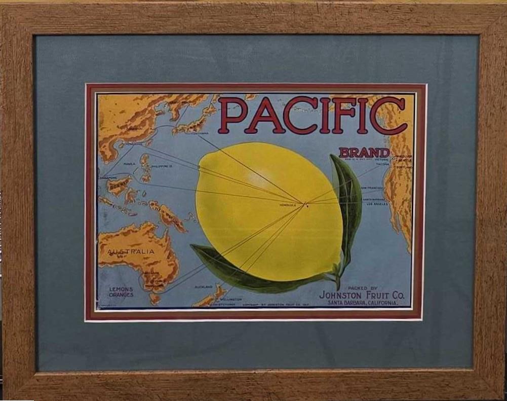
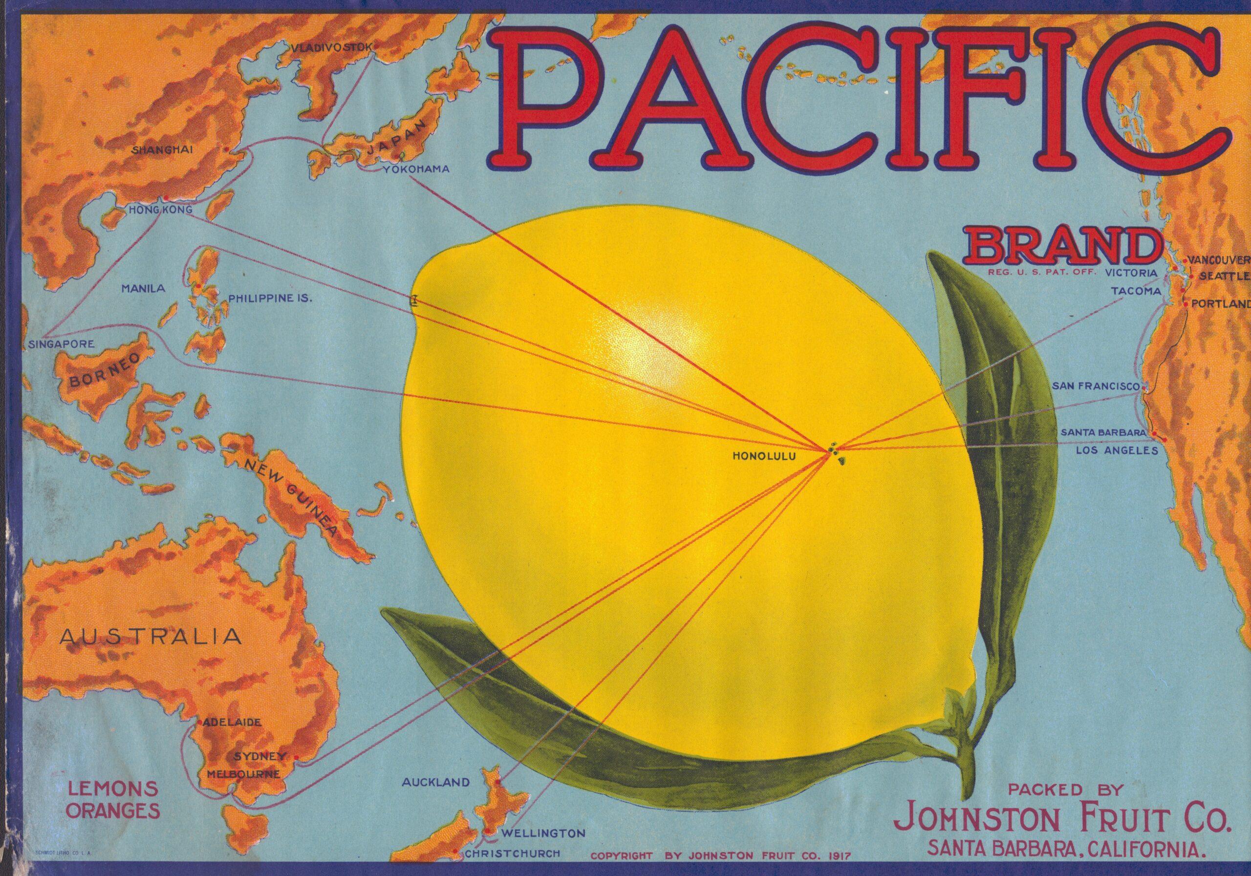
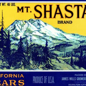
Pacific Brand Lemons Oranges Fruit Label c. 1917
This Pacific Brand Lemons Oranges fruit label is perfect for a kitchen. Copyrighted and Packed by Johnston Fruit Co. Santa Barbara, California. This label was printed by Schmidt Litho Co L. A. and measures 12 3/4 wide by 8 5/8 tall. Framed measurement is 19 1/2 inches by 15 3/4 inches.
Overview of the Pacific Brand Fruit Label
The “Pacific Brand” fruit label refers to a series of vintage crate labels produced under the umbrella of the Pacific Fruit Exchange (also known as the Pacific Fruit & Produce Company or Pacific Coast Fruit Distributors in various historical contexts), a major cooperative in the early 20th-century Pacific Northwest fruit industry. This brand was primarily associated with apples, pears, and other tree fruits shipped from Washington state, such as Wenatchee and Yakima Valley orchards. While not as iconic as California’s citrus labels (e.g., Sunkist), Pacific Brand labels exemplify the broader evolution of fruit crate labeling in the American West. Below, I break down the requested aspects based on historical records and archival insights.
History
Fruit crate labels emerged in the late 19th century as railroads connected Pacific Coast growers to eastern markets, transforming regional agriculture into a national industry. Prior to the 1880s, fruit was shipped in unmarked wooden barrels or crates, often leading to bruising and anonymous sales. The shift to nailed wooden crates allowed for affixed paper labels, first popularized in California’s citrus industry around 1886 but quickly adopted in the Pacific Northwest for apples and pears by the 1890s.
The Pacific Fruit Exchange, formed in 1901 as a grower cooperative (similar to the California Fruit Growers Exchange, later Sunkist), played a pivotal role. Headquartered in Seattle, Washington, it coordinated packing and shipping for member orchards, using “Pacific Brand” labels to standardize and market products. These labels were in peak use from the 1910s to the 1940s, coinciding with the “golden age” of crate art. Production peaked during World War I and the interwar boom, when Northwest apples became a staple export. By the 1950s, corrugated cardboard boxes with pre-printed designs largely replaced wooden crates and pasted labels, ending the era. The Pacific Fruit Exchange dissolved or restructured post-WWII, but its labels survive as artifacts of the cooperative’s legacy in democratizing fruit distribution.
Design Elements
Pacific Brand labels were bold, lithographically printed posters (typically 9–10 inches square) designed for high-visibility on crate ends. Key elements included:
- Imagery: Vibrant, idealized depictions of the Pacific Northwest’s bounty, such as snow-capped mountains (e.g., the Cascades), evergreen forests, or bountiful orchards under clear skies. Early designs (1910s–1920s) featured realistic fruit illustrations—red Delicious apples or golden pears—often with a central brand emblem like a stylized wave or anchor symbolizing the “Pacific” name. Later variants (1930s–1940s) incorporated whimsical motifs, such as a friendly snowman (in the related “Snoboy” sub-brand) waving from behind an apple, evoking winter-harvested Wenatchee fruit.
- Color Palette: Multi-color lithography allowed up to 4–6 hues, with reds and golds for apples, greens for leaves, and blues for skies or water. Borders were ornate, often with geometric patterns or filigree to mimic luxury packaging.
- Typography and Branding: Bold sans-serif fonts proclaimed “Pacific Brand” at the top, with subtitles like “Fancy Apples” or “Wenatchee Grown.” Fine print noted the packer (e.g., “Pacific Fruit Distributors, Seattle”) and grade (e.g., “Extra Fancy”). Designs aimed for emotional appeal—nostalgia for rural America—while complying with emerging USDA standards for origin labeling.
These elements borrowed from broader trends in commercial art, influenced by the Arts and Crafts movement and early advertising, making labels both functional identifiers and aesthetic lures for grocers and consumers.
Cultural Significance
Pacific Brand labels encapsulated the romanticization of the American West during rapid industrialization. They symbolized abundance and pioneer spirit, transforming mundane crates into “windows” to idyllic orchards amid urban expansion. Culturally, they fostered brand loyalty in an era before supermarkets, where colorful labels differentiated Northwest fruit from Eastern barrel-shipped competitors. Labels like Pacific’s often nodded to regional identity—e.g., Native American motifs or cowboy imagery in related designs—reflecting (and sometimes stereotyping) Pacific Northwest folklore.
On a broader scale, these labels were early mass-media art, accessible to working-class immigrants in packing houses and city markets. They mirrored societal shifts: post-WWI optimism in sunny depictions, Depression-era escapism in whimsical figures, and wartime rationing pauses (when fruit went to troops unlabeled). Today, they highlight themes of sustainability and lost agrarian traditions, as wooden crating gave way to plastic-wrapped bulk shipping.
Production Process
Labels were produced via stone lithography, a technique perfected in San Francisco and Seattle print shops like Stecher-Traung Litho Co. The process involved:
- Design: Artists sketched concepts based on grower input, emphasizing regional pride.
- Printing: Ink was applied to limestone slabs etched with the image; up to 10,000 impressions per run on heavy gummed paper. Colors were layered in multiple passes for vibrancy.
- Application: At packing houses, workers sorted fruit by grade, nailed it into pine crates, and pasted labels with flour-water adhesive. Each crate held 40–80 pounds, labeled on one or both ends.
- Scale: Pacific Fruit Exchange coordinated bulk orders, printing thousands annually for members. Costs were low (~$0.01 per label), but quality varied—early single-color stippling evolved to full-color by the 1920s.
This labor-intensive method ensured durability for cross-country rail travel but contributed to the shift to cheaper cardboard by the 1950s.
The Company or Entities Behind It
The primary entity was the Pacific Fruit Exchange (est. 1901, Seattle), a nonprofit cooperative of Washington apple and pear growers modeled after California’s Sunkist. It handled marketing, grading, and distribution for over 1,000 members, using “Pacific Brand” as a house label for premium exports. Closely affiliated was Pacific Fruit & Produce Co. (also Seattle-based, active 1910s–1940s), which packed under sub-brands like Snoboy and State Seal. These were not single corporations but grower alliances, emphasizing collective bargaining against railroads and middlemen. Post-1940s, operations fragmented into smaller distributors like Pacific Coast Fresh Co. (modern descendant, family-owned since 1977), which echoes the legacy in fresh produce but uses contemporary packaging.
Notable Archival Sources or Collections
Several institutions preserve Pacific Brand and related labels, offering digitized access:
- Yakima Valley Libraries (Yakima, WA): Holds the Click Relander Collection with 1,000+ Northwest labels, including Pacific variants. Digitized scans available online; searchable by brand or era.
- Yakima Valley Museum (Yakima, WA): Features a mosaic installation of labels; volunteer-curated exhibits highlight Pacific Fruit designs.
- UC Riverside Citrus Label Collection: Includes Pacific Coast Fruit Distributors’ “Pacoast Brand” (ca. 1900–1940); over 3,000 items, browsable via Calisphere.org.
- UC Davis Special Collections (Lug Label Collection, 1890–1940): Focuses on Pacific Coast tree fruit; documents litho techniques and cooperative histories.
- Published Guides: Fruit Box Labels: An Illustrated Price Guide to Citrus Labels (McClelland & Last, 2003) and Orange Crate Art (Salkin & Gordon, 1981) reference Pacific examples.
These sources emphasize labels as ephemera, with many surviving from unused warehouse stock.
Modern Interest, Collecting, and Cultural Revival
Vintage fruit crate labels, including Pacific Brand, have surged in popularity since the 1970s, driven by nostalgia for mid-century design and sustainable food stories. Collectors value them for graphic appeal—prices range from $10 for commons to $500+ for rare Pacific snowman variants. In the Pacific Northwest, exhibits at the Yakima Valley Museum and California State Railroad Museum (“Pick Me! A Bumper Crop,” 2014) draw crowds, blending art and history.
Revival trends include home decor (framed groupings in kitchens) and commercial nods—e.g., craft cider labels mimicking vintage styles or Portland’s Pacific Coast Fruit Co. rebranding with retro aesthetics. A 2023 OPB feature highlighted local collectors amassing 4,000+ pieces, underscoring regional pride. Globally, similar revivals (e.g., Spain’s Frutas de Diseño exhibit) position labels as “tiny canvases” of cultural heritage, with Pacific examples symbolizing resilient family farming amid climate challenges. Interest is growing, fueled by digitization and social media shares of #VintageCrateLabels.
Packed by Johnston Fruit Co. Santa Barbara, California
Reviews
There are no reviews yet.