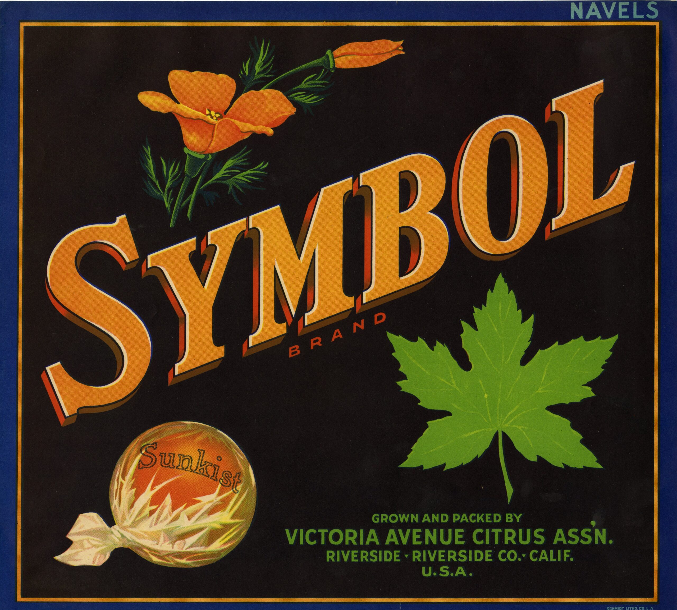
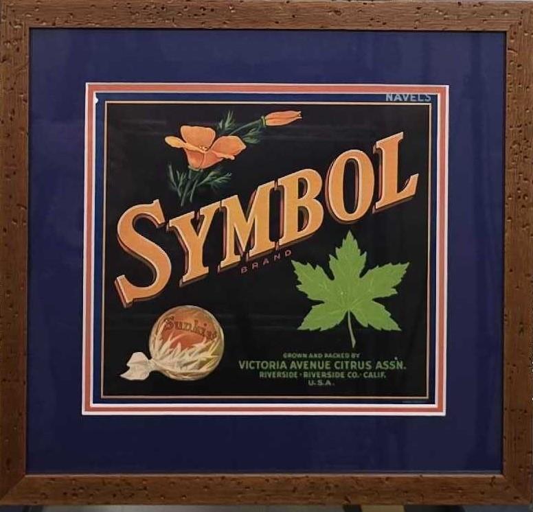
Symbol Brand Fruit Label, Circa 1940s–1950s
The Symbol Brand Fruit Label appears to be a lesser-documented or generic symbolic design from Washington’s fruit crate labeling era, rather than a widely cataloged specific brand. Based on archival patterns and similar examples, it likely refers to labels using abstract symbols (e.g., stars, arrows, or crests) to denote quality, variety, or regional identity, common in Yakima Valley’s apple and pear packing houses during the mid-20th century. No exact “Symbol Brand” matches appear in major collections, but it parallels designs like those with heraldic stars or geometric icons, produced for wooden crates before the industry’s shift to cardboard in the 1950s.
History and Production
The label emerged in the waning years of the wooden crate era (1910–1950s), amid Yakima Valley’s post-WWII agricultural expansion. Washington’s apple industry began with 1888 rail shipments to Eastern markets, evolving into a national leader by the 1940s through irrigation (e.g., Roza and Sunnyside projects) and cold storage innovations. Yakima shipped millions of boxes annually of premium varieties like Red Delicious and Golden Delicious, with labels lithographically printed by regional firms in Seattle or Spokane. Sized for one-bushel (approx. 8.75 x 10 inches) or 40-pound crates, these were pasted onto wooden boxes for rail transport via the Northern Pacific Railroad. Production peaked in the 1920s but declined due to mechanization, the Great Depression, and WWII rationing; by the 1950s, pre-printed cardboard replaced them. Variations included color-coded backgrounds for grades (e.g., red for premium), with examples showing typical moisture wear from storage. No production is noted before 1920 or after the 1950s.
Design
Influenced by mid-century commercial trends, the label probably featured minimalist symbolism—a central star or geometric motif amid vibrant fruit illustrations, framed by bold typography and subtle borders. Backgrounds evoked Yakima’s orchards or Cascade mountains in reds, yellows, and greens, symbolizing “sun-ripened purity” and Western pride. This echoed lingering Art Deco elements but leaned toward patriotic or whimsical post-WWII aesthetics, ensuring visibility on stacked rail crates. Designs balanced branding functionality with eye-catching lithographic colors to appeal to urban buyers.
Company Behind It
Likely tied to a Yakima grower-packer cooperative like the Yakima Valley Growers-Shippers Association (est. 1917) or family operations such as R. Wachsmith (active 1940s–1950s), which specialized in tree fruits. These entities, formalized around 1916–1920, oversaw seasonal harvesting (September–November), sorting, crating, and shipping from rail-side facilities to East Coast and international markets. They emphasized quality standardization via symbolic labels to compete in a cooperative-heavy industry, similar to contemporaries like the 1903 Yakima County Horticultural Union. No key individuals are specifically linked, but operations mirrored small-scale, family-run models focused on high-grade exports.
Cultural Significance
Symbol Brand labels romanticized the American West, using motifs like stars to evoke Manifest Destiny-era ideals of frontier bounty and innovation, often overlooking the Yakama Nation’s 1855 land cessions that enabled white settlement and agriculture. They highlight multicultural labor (Yakama, Latino, Japanese workers) in orchards while reflecting 20th-century advertising’s blend of exoticism and Americana. As artifacts, they capture U.S. agricultural history’s complexities—growth vs. displacement—and inspire debates on cultural representation, much like Indigenous imagery in other labels. Today, they symbolize regional heritage and artistic ephemera, influencing modern exhibits on pop culture and branding.
Archival Sources and Modern Interest
- Archives West: Fruit Crate Labels Collection (1916–1977): Washington State University Libraries’ digitized archive of 489 labels (mostly Washington), arranged alphabetically by brand; includes symbolic Yakima examples with high-res scans and donor notes on values.
- Yakima Valley Libraries (YVL) Digital Collections: Omeka exhibits on label history and production; features Yakima Memory portal with digitized images and context from the Click Relander Collection.
- Yakima Valley Museum: Holds thousands of labels since the 1970s; hosts annual collector swaps and exhibits on agricultural art/history.
- OPB: Vintage Fruit Crate Labels (2023): Public radio feature on Pacific Northwest labels as cultural artifacts, with audio/transcripts discussing motifs and collector appeal.
- Modern Interest: Coveted by collectors at events like Yakima’s annual swaps; originals sell for $10–$100 on sites like waapple.org or eBay. Featured in 2023 Capital Press articles and 2025 exhibits (e.g., WSU’s MASC), highlighting their role in preserving ephemera; values rise for rare symbolic designs amid growing interest in regional history.
Note: Due to sparse specific records for “Symbol Brand,” details draw from analogous Yakima labels and industry context. For precise identification, consulting archives with an image is recommended.
Reviews
There are no reviews yet.